Illustrating Bleak House
This post is contributed by Gerry Mooney, a (now retired) commercial artist and illustrator from New York. Mooney is also a longtime Charles Dickens fan and he has embarked on a project to illustrate Dickens’s great Bleak House. Mooney can be found online https://gerrymooneyillustratingdickens.com/
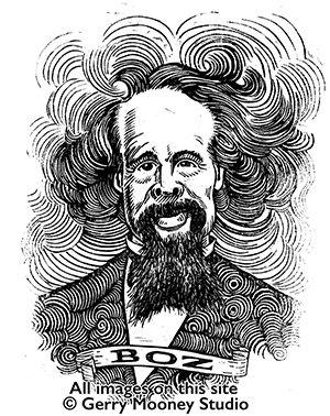
Charles Dickens Linocut Portrait Gerry Mooney, 2021.
The sprawling Bleak House is singular among Dickens’s works. As an artist, I find the appeal is largely visual, as Dickens effortlessly constructs characters, images and scenarios that beg to be imagined into physical reality.
I first read it decades ago and never stopped thinking about it. I knew that someday I would attempt to illustrate it, but my work as a commercial artist in the high-pressure New York market made it an easy project to put off. Once I set pencil to paper, there would be no turning back, and now that I’m retired, I have no more excuses.
I’ve always liked linoleum cutting as an art medium since I learned it in school, but I’ve only worked in it occasionally. It seemed like it would be a good “look” for illustrating Dickens. It mimics the feel of woodcut illustration, and though it is a demanding medium, it’s more forgiving and easier to work with than wood. It also lends itself to heavy blacks, which I felt would suit the material.
While I started sketching some illustration ideas, I also wanted to learn about the original artists’ contributions to the first (and subsequent) editions of BH and others, and so I undertook to learn as much as possible on the subjects of Phiz’s illustration career and Dickens’s working relationship with his artists.
I find Hablot K. Browne’s Bleak House illustrations somewhat lackluster, and apparently I’m not alone in this. Steig calls the Bleak House illustrations “far more uneven” than earlier novels, and calls the comic plates “weak, even sloppy” (131). Leavis finds Browne’s work here “disappointing” (359-360). Browne’s other works are much more lively and engaging and show an artist fully invested in the creative process.
Most of the character illustrations for Bleak House are designed in a prosaic manner, with people arranged in front of a wall, gesturing. I wonder if Dickens’s theatrical tendencies were driving the car here, as if the characters are merely on a stage, instead of in the world. The repeated motif of Esther Summerson’s back turned to the viewer is curious. As Steig says in Dickens and Phiz (1978), this was to reinforce her resemblance to Lady Dedlock, who also appears in several plates with her face hidden and in a similar shawl and bonnet (148). When Esther’s face is finally seen, however, she is not characterized in any interesting way.
The well-known “dark plates” are another story. This is a term for ten of the forty illustrations that are created with a more labor-intensive and detailed engraving technique that allowed for subtle shades of gray. Their somber tone gives them more depth, especially due to the absence of any cartoonish characters or busy pen-work. In contrast to the character illustrations, almost none are limited to a stage-like setting. The dark plates are no longer on the stage, but in the world, making them perhaps more appealing to the modern eye.
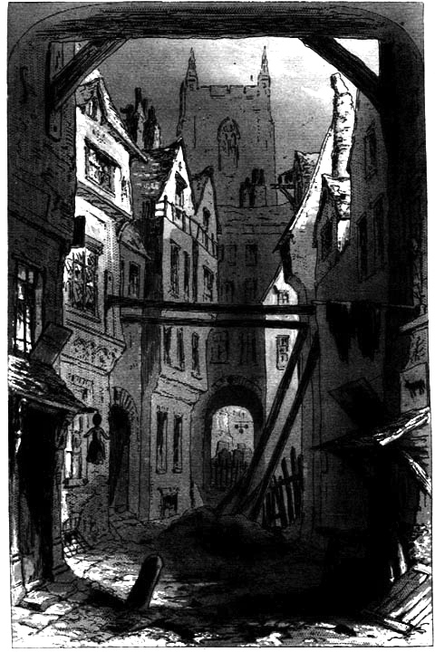
Tom All Alone’s. Phiz (Hablot K. Browne), April 1853.
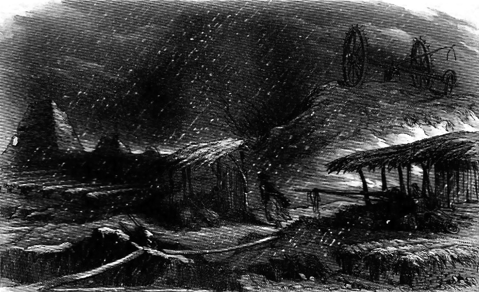
The Lonely Figure. Phiz (Hablot K. Browne), August 1853.
Two of the most striking of the dark plates: Tom All Alone’s, and The Lonely Figure. While all the Bleak House illustrations are steel engravings, the dark plates use a more complicated engraving process, which gives them the appearance of wash drawings, rather than pen and ink. All the dark plates are in the second half of the story, paralleling the darker tone of that section of the novel.
Having been raised on TV and Marvel Comics, I saw a different visual approach possible for the book as a whole. For one thing, from an illustrator’s point of view, I looked at it primarily as a haunted house story, and if England is the house and Chancery is the ghost, maybe it is. This gave me a jumping off point for how scenes were staged, what incidents were key to illustrate, and how characters reacted to plot turns and to each other. I also wanted to “characterize” the characters the way I saw them, which of course is much different than Browne’s concepts.
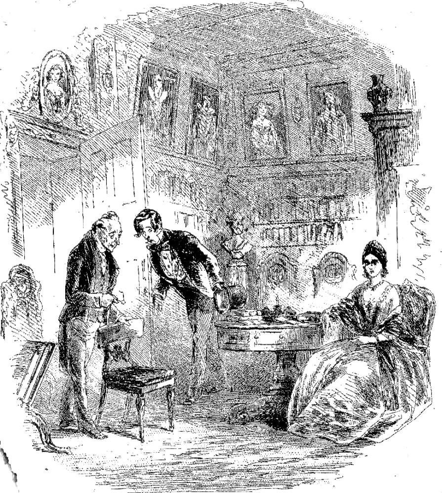
The old man of the name of Tulkinghorn. Phiz (Hablot K. Browne), January 1853.
I think Tulkinghorn and what he represents are short-changed here, showing him merely walking into a room, somewhat subserviently. Likewise, Lady Dedlock is not looking good either, and though the rendering of her face may just be a problem with this print, her figure is under-realized and without personality.
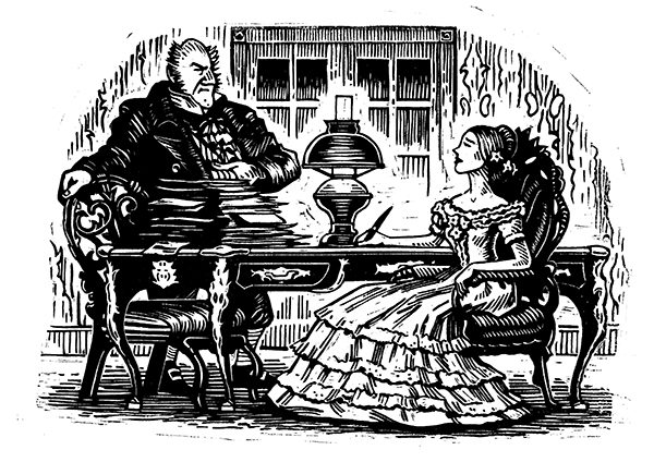
Mr. Tulkinghorn and Lady Dedlock. Gerry Mooney, 2021.
I instead chose the moment in the story when Tulkinghorn wields his greatest power and Lady Dedlock is at her weakest. This imbalance belies the symmetrical design. Tulkinghorn, cinched and girded to the chin, stands behind a mountain of legal documents, the desk, and a heavy chair. Lady Dedlock, seated, passive, throat exposed, ready to write what he dictates, is entirely stripped of agency. The centered lamp tells us that in this scene, there are no shades of gray, only black and white. “They look at each other, like two pictures” (Bleak House, ch. 41) is the phrase that cements this image.
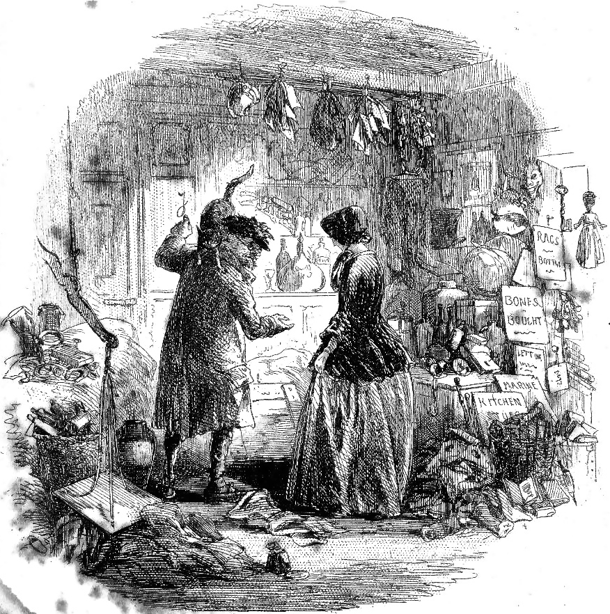
The Lord Chancellor Copies from Memory. Phiz (Hablot K. Browne), April 1852.
First I should say that this image of Browne’s is really exquisite. I especially like the detail of the environment and the beautifully handled lights and darks. But much like the above image of Tulkinghorn, I feel like this rendering of Krook is too “nice.”
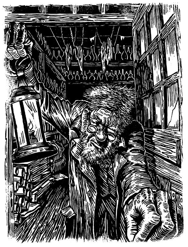
Mr. Krook. Gerry Mooney, 2021.
There’s an implied menace to this character, and the way we meet him, that needed to be given more emphasis. Flinging open the door and thrusting his lantern in the reader’s face was the image that I felt defined him best.
I began this project imagining a set of full-page illustrations, but when I had several completed, and I began laying out the book itself, I made a startling discovery: as a reader I wasn’t that interested in full page images. What my eye as a reader wanted to see was smaller vignettes tucked into the text. This realization changed the shape of the project.
As I was working out whether to plan this as a print book or an e-book, I discovered quickly that these are two completely different creatures. The main differences are the number of words per page, and that an e-book has no two-page spreads but is entirely dependent on the single page format. This being the case, full-page images are not particularly useful. So, the plan for smaller illustrations works well, but an e-book needs more illustrations. I feel that if I want to call this an “illustrated novel,” there should be a picture at least every ten pages or so, but this is an entirely subjective decision on my part.
I like the idea of doing images that are suggested by the text, even if they aren’t scenes with characters. This works well for the smaller vignette-style illustration, and it frees me to imagine ideas that capture the feel of the story with metaphor, at the same time involving less meticulous research.
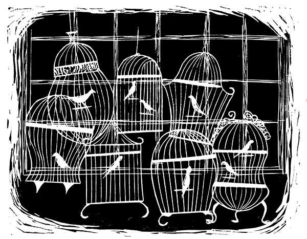
Miss Flite’s Birds. Gerry Mooney, 2021.
This is pure graphic design and has proved very popular. The negative treatment was a simple creative decision because of how cutting linoleum works, which in a nutshell is that it’s easier to make a white line than it is a black line. It also gives this simple line drawing more visual weight.
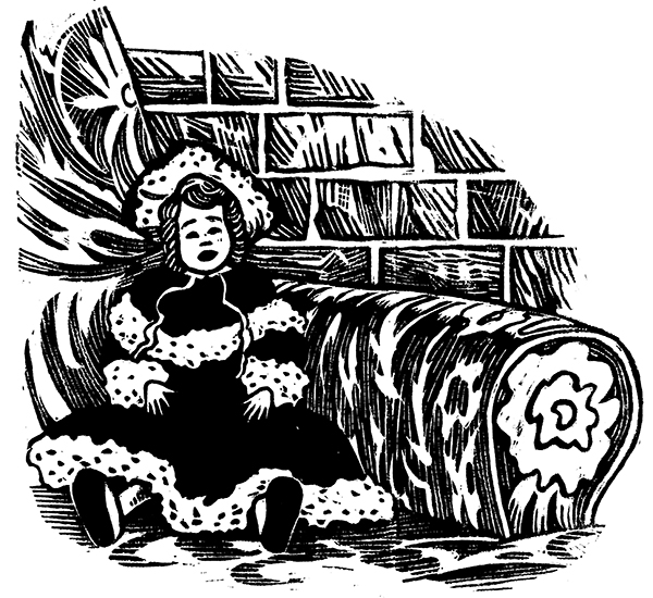
Esther’s Dolly. Gerry Mooney, 2021.
When Esther begins her narration, and talks about her little Dolly, I felt that the doll was a better image for Esther than Esther herself. The doll’s placement represents Esther: metaphorically propped up in an elegant armchair, but against a brick wall.
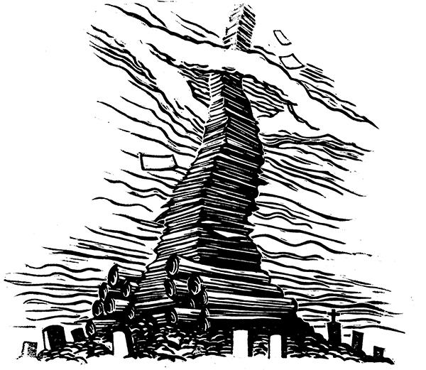
Mountain of Documents. Gerry Mooney, 2021.
When the human destruction wrought by Chancery is described, the image of an infinite stack of legal documents, with headstones scattered at its base, suggested itself.
I don’t know yet what form the final book will take. An e-book will need more illustrations, but a print book will be more complicated to produce and market. I’m currently working on a “pilot project” e-book, consisting of the first seven chapters of Bleak House fully illustrated, to serve as a calling card and example of what the final book, whether electronic or print, will ultimately look like. In the meantime, I continue to create more images. The inspiration from this book is bottomless.
Works Cited and Consulted:
Browne, Hablot K. The Lonely Figure. August 1853. Image scan by George P. Landow, The Victorian Web, https://victorianweb.org/art/illustration/phiz/bleakhouse/35.html
—. The Lord Chancellor Copies from Memory. April 1852. Image scan by George P. Landow, The Victorian Web, https://victorianweb.org/art/illustration/phiz/bleakhouse/4.html
—. The old man of the name of Tulkinghorn. January 1853. Image scan by George P. Landow, The Victorian Web, https://victorianweb.org/art/illustration/phiz/bleakhouse/22.html
—. Tom All Alone’s. April 1853. Image scan by George P. Landow, The Victorian Web, https://victorianweb.org/art/illustration/phiz/bleakhouse/29.html
Dickens, Charles. Bleak House. Project Gutenberg, February 21, 2012, https://www.gutenberg.org/files/1023/1023-h/1023-h.htm.
Farrar, Aileen. “Charles Dickens and Hablot K. Browne: cross-narrative creation and collaboration in Bleak House.” Victorians: A Journal of Culture and Literature, no. 122, fall 2012, pp. 36+. Gale Literature Resource Center, link.gale.com/apps/doc/A316458785/LitRC?u=anon~2f2164c9&sid=googleScholar&xid=7f48f178. Accessed 17 April 2022.
Landow, George P. and Philip V. Allingham. “The Normal Printing Process: Steel Plate Engravings and Dark Plates,” The Victorian Web, https://victorianweb.org/art/illustration/phiz/bleakhouse/25.html. Accessed 17 April 2022.
Leavis, F.R. and Q.D. Leavis, Dickens the Novelist. Pantheon, 1970.
Mooney, Gerry. Charles Dickens Linocut Portrait. 2021. Gerry Mooney Illustrating Dickens, https://gerrymooneyillustratingdickens.com/
—. Esther’s Dolly. 2021. Gerry Mooney Illustrating Dickens, https://gerrymooneyillustratingdickens.com/
—. Miss Flite’s Birds. 2021. Gerry Mooney Illustrating Dickens, https://gerrymooneyillustratingdickens.com/
—. Mountain of Documents. 2021. Gerry Mooney Illustrating Dickens, https://gerrymooneyillustratingdickens.com/
—. Mr. Krook. 2021. Gerry Mooney Illustrating Dickens, https://gerrymooneyillustratingdickens.com/
—. Mr. Tulkinghorn and Lady Dedlock. 2021. Gerry Mooney Illustrating Dickens, https://gerrymooneyillustratingdickens.com/
Perdue, David A. “Learn about the original illustrations for Dickens’ works,” The Charles Dickens Page, https://www.charlesdickenspage.com/charles-dickens-illustrations.html#phiz. Accessed 17 April 2022.
Steig, Michael. Dickens and Phiz. Indiana University Press, 1978.
Impressive! Love the emotion in these images
Gerry Mooney’s iBleak House illustrations spring from the page. His perspective drawings look like stop action photographs ..in pen & ink
Comparing the original illustrations of Bleak House to Gerry Mooney’s, what I feel is a big infusion of the vivacious.
Thank you for your work as an artist and for the discussion of the Phiz illustrations as well as why you have chosen to approach the imagery differently. I just finished reading Bleak House (having read it a couple times within the past 30 years), and I appreciate the work to create illustrations to accompany such a rich work with so many visual references.